Reshaping Data
When working on data science projects, you will need to manipulate the shape of your data quite often. Depending on the analysis you are conducting, you may need to transform your data into a different structure. This post includes information on what reshaping data is, why it’s important, how to reshape your data, and an example of reshaping data between formats.
What
Reshaping data is the process of transforming your data from one format to another.
Wide format - each subject is a row and each variable is column. Multiple observations from the same subject can be in the same row. This typically results in many columns (Fig. 1).
Long format (tidy data) - each observation is a row and each variable is a column. Each distinct observation has its own row. This typically results in many rows (Fig. 3).
Why
There are various reasons why you might want to reshape your data. For data analysis, many statistical methods and ML algorithms require data to be in long format. Some R packages for data visualization require data to be in long format (e.g. ggplot2), while others require wide format (e.g. ComplexHeatmap). Depending on the specific data science approach you are using, you will need to reshape your data at some point, so it is helpful to understand the concept and know how to use it.
How
The most common R package used to reshape data is tidyr. Here are some typical operations used to reshape data in R:
pivot_longer()
- Converts data from wide to long format
- package: tidyr
pivot_wider()
- Converts data from long to wide format
- package: tidyr
melt()
- Converts data from wide to long format
- Allows specifying id.vars and measure.vars
- package: reshape2
cast()/dcast()/acast()
- Converts data from long to wide format
- Can aggregate when multiple values map to same cell
- dcast() for data.frames; acast() for arrays/matrices
- package: reshape2
Examples
This short script demonstrates the two main data formats and figures that can be created from them. For this example, we will be using a toy dataset of RNA sequencing gene counts. The first step is to load the packages needed and generate the data.
          library(tidyr)
          library(dplyr)

          # 0. Create Toy RNA-seq wide data
          rna_seq_wide <- data.frame(
            gene = c("geneA", "geneB", "geneC"),
            sample1_control = c(100, 200, 150),
            sample2_control = c(110, 210, 160),
            sample1_treated = c(300, 400, 350),
            sample2_treated = c(320, 420, 360)
          )

          print(rna_seq_wide)
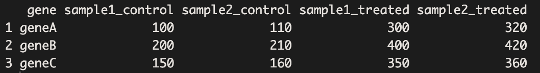
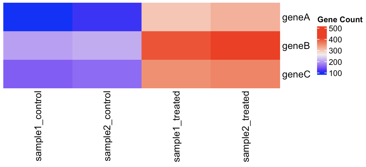
The data we created are in wide format which is useful for creating figures like heatmaps. Now, we will use ComplexHeatmap to display the gene counts for each sample.
          # 1. Plot heatmap using wide format data

          rna_seq_wide %>%
            column_to_rownames("gene") %>%
            Heatmap(cluster_columns = F, cluster_rows = F, name="Gene Count")
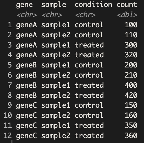
We can use the pivot_longer() function to reshape our data from wide to long format. After the reshaping step, we will use the separate() function to split the “sample_condition” column into two columns indicating the sample name and condition of each observation.
          # 2. Pivot longer: from wide to long

          rna_seq_long <- rna_seq_wide %>%
            pivot_longer(
              cols = -gene,
              names_to = "sample_condition",
              values_to = "count"
            )

          # 3. Separate the 'sample_condition' column into 'sample' and 'condition'

          rna_seq_long <- rna_seq_long %>%
            separate(sample_condition, into = c("sample", "condition"), sep = "_")

          print(rna_seq_long)
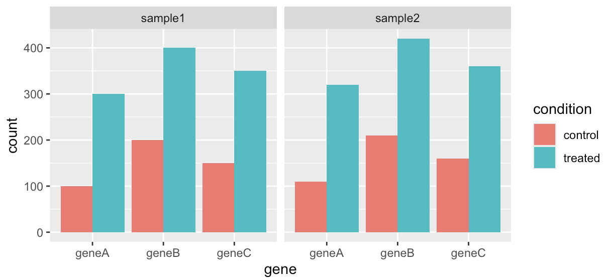
Now that each row represents a single observation, our data are in long format, also known as tidy data. Since we have tidy data now, we can use ggplot2 to generate bar plots displaying the gene counts for each sample.
          # 4. Plot barplot for gene count between treatment conditions

          ggplot(rna_seq_long)+
            geom_col(aes(x=gene,y=count,fill=condition),position = "dodge")+
            facet_wrap(~sample)